ABOUT ME

Crafting visual stories

One pixel at a time

My Experiences

Let's work together, I'm open for full time / freelance

With a diverse background spanning UX design, product development, and digital strategy, I bring a unique perspective to each project.

Let’s connect and bring your ideas to life—I’m currently open for collaborations.

LUDWIG.GURU

UX Designer

2022 - PRESENT

Albamedia

Digital Designer

2018-2022

Zoe magazine

Product Designer

2018

artbiztech

Director

2015 - 2018

UXSERVICES

UX Designer

2012-2013

University of Michigan

UX Principles & Processes

Online course

2021

Vilnius University

Marketing & Communication

Master in Business Management

2016-2018

Izmir University of Economics

Advertising & Public Relations

Double major

2013 - 2016

Universidade do Minho

Communication Sciences

Erasmus

2012 - 2013

Izmir University of Economics

Media & Communication

Bachelor

2010-2015

My Education

Throughout my education, I’ve explored the many dimensions of business, communication, and design to understand how they intersect. From studying media and advertising to marketing and UX principles, each step has contributed to my holistic understanding of how ideas can be communicated effectively and transformed into impactful solutions.

My diverse academic path reflects my commitment to blending creativity with strategy, ensuring that every project I approach is grounded in a rich foundation of knowledge.

Designing with purpose

I learned that every project could have a flexible approach because of timing, budget, or strategy, but the most important things are the goals and results. My experience is a hybrid between Design Thinking, Lean, and Agile methods.

End-to-end creative design

From brand identity to marketing campaigns, delivering cohesive design across all channels

Visual Design

Crafting compelling visuals that communicate, captivate, and align with each brand’s unique identity.

UX/UI Design

Creating user-centered interfaces that enhance functionality, ensuring intuitive and enjoyable journeys.

Marketing Design

Developing effective marketing content, and social media campaigns, that drives engagement and visibility

Brand Design

Building memorable brand identities that tell stories, connect with audiences, and drive recognition.

Website Design

Designing accessible, responsive websites that engage users and deliver seamless online experiences.

Request for more

Maybe you have something different in your mind, I really enjoy learning new things.

2023

Developed a unified web experience, bridging mobile, desktop, and web platforms to meet the needs of a diverse and extensive user base.

2022

Blending tech and fine dining elements, winning Bronze at Premio Agorà for its distinctive identity.

2021

Designed region-specific websites that are accessible, clear, and user-focused, catering to over 20,000 residents across five islands.

Ludwig.guru

Role

Lead UX/UI Designer (sole designer)

Overview

The Ludwig.guru Web App Redesign unified website, desktop, and mobile into a seamless experience, enhancing usability and consistency for 2M+ users.

Responsibilities

• Conducted user surveys and competitor analysis.

• Led brainstorming sessions to generate ideas.

• Designed wireframes, prototypes, and final UI.

• Managed the A/B testing process and incorporated results into the final design.

• Worked closely with the frontend team to ship the product.

Main Goal

To build a web app for Ludwig.guru that unifies the existing website, desktop, and mobile apps, while fixing core UX issues across all platforms.

Target Audience

Approximately 2 million registered Ludwig users, ranging from casual learners to advanced users seeking writing assistance.

Process

Research Phase:

Methods: Conducted user surveys to gather insights from existing Ludwig users, performed competitor analysis to understand market standards, and used A/B testing to compare different design solutions.

Key Findings: Users found the interface across different platforms inconsistent, leading to confusion and inefficiency. They wanted smoother navigation and better integration between desktop and mobile experiences.

Ideation Phase:

Approach: Facilitated brainstorming sessions to explore possible solutions, then moved to wireframing and iterative prototyping to test out designs. This phase focused on creating a unified experience across platforms while resolving user pain points.

Design and Development Phase:

Design Challenges: The key challenge was to unify the UX across multiple platforms (website, mobile, desktop) while maintaining performance and usability.

Solutions: Implemented a consistent design language across all platforms, streamlined navigation by reorganizing key features, and created a more user-friendly interface with improved search capabilities.

Testing and Implementation Phase:

Testing Methods: Conducted A/B tests to evaluate different navigation structures and layout changes. Usability testing sessions were performed with real users to identify pain points.

Feedback Integration: User feedback indicated a preference for a simpler, more streamlined interface, which was incorporated by reducing visual clutter and improving search functionality.

Outcome

Quantitative Results: 

The redesign led to a 20% increase in user engagement and a 15% reduction in bounce rates across all platforms.

Qualitative Feedback: 

Users appreciated the improved consistency and usability across platforms, particularly the smoother transitions between the desktop and mobile versions.

Personal Reflection: 

Working as the sole designer on this project taught me the importance of seamless cross-platform UX design and strengthened my ability to manage the end-to-end design process, from research to frontend handoff.

Conclusion

Project Summary: 

The Ludwig.guru web app redesign successfully unified the user experience across platforms, leading to improved user engagement and satisfaction. This project further honed my UX skills, particularly in cross-platform design and iterative testing.

MEC Restaurant & Museum

Role

Lead UX/UI designer and branding specialist

Overview

MEC combines a Michelin-starred restaurant and an Apple museum, merging culinary excellence with digital innovation. I developed the brand identity and website, integrating the elegance of fine dining with Apple’s nostalgic 80s aesthetic. The branding received the Bronze Agora Award for its creative fusion of these two worlds

Responsibilities

• Developed the brand identity, including the first logo inspired by Apple’s early 80s logo


• Designed and built the website to create a seamless experience that bridges the two worlds of fine dining and digital culture


• Crafted visual branding elements that reflect the dual nature of MEC’s concept

Main Goal

To create a brand identity and digital experience for MEC, a unique Michelin-starred restaurant and Apple museum that merges culinary art with the spirit of digital innovation

Target Audience

Visitors interested in high-end culinary experiences, tech enthusiasts, and tourists exploring Palermo’s cultural and historic scene

Process

Research Phase:

Methods: Analyzed the identities of similar high-end restaurants and tech museums. Studied Apple’s early branding and interviewed stakeholders to understand the experience envisioned for MEC

Key Findings: The brand needed to effectively communicate both the rigor of a Michelin-starred restaurant and the dynamic, colorful history of Apple’s technology

2. Ideation Phase:

Approach: Developed branding concepts that visually integrate culinary excellence with tech culture. Explored the use of rainbow colors from Apple’s 80s logo to symbolize creativity and nostalgia.

3. Design and Development Phase:

Design Challenges: Balancing the refined aesthetic of a Michelin-starred experience with the vibrant, tech-oriented theme of the museum

Solutions: Created a logo that fused the elegance of fine dining with the playful rainbow elements of Apple’s history. The website was designed to maintain this balance, with sleek visuals and interactive elements that highlight both aspects of MEC

4. Testing and Implementation Phase:

Testing Methods: Conducted user feedback sessions with early visitors to the restaurant and museum, focusing on the website’s ease of use and the branding’s ability to convey MEC’s unique offering

Feedback Integration: Refined branding elements to better capture the dual experience and adjusted website navigation based on user input to improve accessibility

Outcome

Quantitative Results: 

 The MEC website saw a 25% higher engagement rate compared to similar venues, with users spending more time exploring both the culinary and tech sections.

Qualitative Feedback: 

 Visitors appreciated the nostalgic Apple-inspired branding, noting that it enhanced their overall experience and effectively merged the two worlds.

Personal Reflection: 

 This project taught me the nuances of integrating two distinct cultural experiences into a cohesive brand identity, balancing elegance with energy.

Conclusion

Project Summary: 

MEC successfully brought together the worlds of fine dining and digital nostalgia through a cohesive brand and digital experience. The branding and website design received wide recognition, culminating in a Bronze Agora Award for branding excellence.

RESPONSIVE

PIXEL-PERFECT

Retina Ready

Customizable

Selis

Role

Lead UX/UI Designer (sole designer)

Overview

Selis involved designing accessible websites for five Sicilian islands, unifying their digital experience and highlighting Selis’s commitment to sustainable energy. As the sole designer, I handled everything from research to deployment, ensuring consistent branding and an accessibility-first design approach for the 20,000 island residents

Responsibilities

• Conducted user surveys and A/B tests to understand and improve user interactions

•Developed a clean, modern brand identity with a logo concept reminiscent of a plug, representing connectivity to sustainable energy

•Designed accessible, UI-friendly layouts consistent across all five websites, emphasizing Selis’s renewable energy and sustainability initiatives

•Oversaw the full process from initial brainstorming through final deployment

Main Goal

To create accessible, modern websites for five regions (Lampedusa, Marettimo, Favignana, Linosa, and Pantelleria) under Selis, the distribution system manager, with a unified and brand-consistent design

Target Audience

Approximately 20,000 citizens across the five islands, including residents and businesses seeking transparent information on local energy distribution and sustainable practices

Process

Research Phase:

Methods: Conducted user surveys to gather feedback from residents on website preferences and needs, with a focus on interest in sustainable energy information. Performed A/B tests to evaluate layout variations that best highlighted renewable energy content

Key Findings: Users valued clear information on Selis’s sustainable energy projects, like microgrids and renewable energy usage. They also sought accessible navigation and minimalist design for quick access to energy status updates

Ideation Phase:

Approach: Brainstormed initial concepts focused on accessibility, sustainability, and consistency. Created wireframes that highlighted information on renewable energy initiatives, allowing users to easily understand Selis’s role in supporting a green energy transition

Design and Development Phase:

Design Challenges: Balancing modern aesthetics with accessibility requirements for a wide-ranging audience, while effectively communicating Selis’s green energy mission

Solutions: Designed a dedicated section on each website to highlight Selis’s sustainable energy projects, allowing users to explore initiatives like microgrids and renewable sources. Created a simple, icon-driven navigation system and large, readable text to enhance accessibility

Testing and Implementation Phase:

Testing Methods: Conducted A/B testing to refine the display of sustainability-focused content. Held feedback sessions to ensure that users could easily find information on renewable energy projects

Feedback Integration: Users valued the inclusion of clear information on Selis’s sustainability efforts, so content was adapted to improve visibility of green initiatives

Outcome

Quantitative Results: 

Increased user engagement metrics by 18%, shown through page visit durations and lower bounce rates, particularly on pages highlighting renewable energy content

Qualitative Feedback: 

Users expressed appreciation for the focus on sustainable energy information, noting that it underscored Selis’s commitment to environmental responsibility and enhanced the sites’ relevance

Personal Reflection: 

This project reinforced my skills in designing for accessibility and sustainability, deepening my understanding of how to communicate green energy efforts through UX/UI

Conclusion

Project Summary: 

The Selis regional websites project effectively communicated Selis’s role in sustainable energy distribution across the islands, offering an accessible, user-centered platform. The websites support the islands’ transition to green energy by providing clear, relevant information and enhancing digital accessibility, a vital aspect of Selis’s mission

RESPONSIVE

PIXEL-PERFECT

Retina Ready

Customizable

Naka no profit

Role

Branding and Web Designer (Sole Designer)

Overview

NaKa is an initiative in Palermo’s Capo district aimed at building a sustainable and active community through education and social justice. I created the brand identity, website, and marketing materials to reflect NaKa’s mission of inclusivity and empowerment. The branding successfully captured the spirit of community growth and social change, helping establish NaKa as a key player in local activism.

Responsibilities

• Developed NaKa’s brand identity, ensuring it conveyed their mission of community empowerment and inclusion.
• Designed and built the website to provide information on NaKa’s initiatives and activities.
• Created all marketing materials to promote NaKa’s educational programs and community events.

Naka New

Main Goal

 To create a cohesive brand identity and website for NaKa, an organization established to foster a sustainable and active community in the Capo district of Palermo, with a focus on education, human rights, and combating violence and discrimination

Target Audience

Community members, educators, activists, and individuals interested in non-formal education, human rights, and social inclusion

Process

Research Phase:


Methods: Conducted stakeholder interviews to understand NaKa’s mission and goals. Analyzed community needs to align branding and website features with the organization’s values.
Key Findings: The brand needed to communicate both a sense of community and the urgency of social justice work, appealing to local residents and prospective supporters.


Ideation Phase:
Approach: Explored visual concepts that represented sustainability, activism, and education. Developed color schemes and logo designs that symbolized growth, community, and empowerment.


Design and Development Phase:
Design Challenges: Balancing a professional look with an approachable and community-focused visual identity to appeal to a diverse audience.
Solutions: Created a logo that symbolizes unity and growth, using warm and vibrant colors to convey a sense of energy and community. Designed a website that was easy to navigate, highlighting NaKa’s mission and ongoing initiatives.

Testing and Implementation Phase:
Testing Methods: Collected feedback from stakeholders and community members to evaluate the effectiveness of branding and the usability of the website.
Feedback Integration: Incorporated feedback to adjust design elements to make the website more intuitive and marketing materials more impactful.

Naka New2

Outcome

Quantitative Results: 

Successfully launched and get community engagement, reflected by a rise in participation in NaKa’s events and activities.

Qualitative Feedback: 

Community members and stakeholders appreciated the clear and vibrant branding, which helped establish NaKa as a trusted, approachable organization focused on positive change.

Personal Reflection: 

Working on NaKa was a rewarding experience, allowing me to create an impactful visual identity that supports an important mission of social justice and community development.

Conclusion

Project Summary: 

The NaKa branding and website project successfully communicated the organization’s mission of fostering community, sustainability, and inclusivity. The brand identity and marketing materials played a crucial role in engaging the community and raising awareness about NaKa’s efforts to promote social justice.

Naka New4

CHANEL

Role

Videographer (Editor)

Overview

Working with CHANEL, I contributed to digital marketing projects that align with the brand’s legacy of sophistication and timeless elegance. My focus was on creating designs that resonate with CHANEL’s identity while engaging their global audience. By integrating seamless user experiences and visually stunning aesthetics, the projects emphasized the balance between tradition and modernity, ensuring every interaction reflected CHANEL’s unparalleled standard of luxury.

Responsibilities

• Conducted user surveys and competitor analysis.

• Led brainstorming sessions to generate ideas.

• Designed wireframes, prototypes, and final UI.

• Managed the A/B testing process and incorporated results into the final design.

• Worked closely with the frontend team to ship the product.

Main Goal

To build a web app for Ludwig.guru that unifies the existing website, desktop, and mobile apps, while fixing core UX issues across all platforms.

Target Audience

Approximately 2 million registered Ludwig users, ranging from casual learners to advanced users seeking writing assistance.

Process

Research Phase:

Methods: Conducted user surveys to gather insights from existing Ludwig users, performed competitor analysis to understand market standards, and used A/B testing to compare different design solutions.

Key Findings: Users found the interface across different platforms inconsistent, leading to confusion and inefficiency. They wanted smoother navigation and better integration between desktop and mobile experiences.

Ideation Phase:

Approach: Facilitated brainstorming sessions to explore possible solutions, then moved to wireframing and iterative prototyping to test out designs. This phase focused on creating a unified experience across platforms while resolving user pain points.

Design and Development Phase:

Design Challenges: The key challenge was to unify the UX across multiple platforms (website, mobile, desktop) while maintaining performance and usability.

Solutions: Implemented a consistent design language across all platforms, streamlined navigation by reorganizing key features, and created a more user-friendly interface with improved search capabilities.

Testing and Implementation Phase:

Testing Methods: Conducted A/B tests to evaluate different navigation structures and layout changes. Usability testing sessions were performed with real users to identify pain points.

Feedback Integration: User feedback indicated a preference for a simpler, more streamlined interface, which was incorporated by reducing visual clutter and improving search functionality.

Outcome

Quantitative Results: 

The redesign led to a 20% increase in user engagement and a 15% reduction in bounce rates across all platforms.

Qualitative Feedback: 

Users appreciated the improved consistency and usability across platforms, particularly the smoother transitions between the desktop and mobile versions.

Personal Reflection: 

Working as the sole designer on this project taught me the importance of seamless cross-platform UX design and strengthened my ability to manage the end-to-end design process, from research to frontend handoff.

Conclusion

Project Summary: 

The Ludwig.guru web app redesign successfully unified the user experience across platforms, leading to improved user engagement and satisfaction. This project further honed my UX skills, particularly in cross-platform design and iterative testing.

RESPONSIVE

PIXEL-PERFECT

Retina Ready

Customizable

Click&Sport

Role

Branding and UX/UI Designer (Sole Designer)

Overview

Click&Sport was a platform designed to bring together sports activities, gyms, trainers, and enthusiasts. I led the branding, creating a dynamic logo, landing page, and promotional video. The project had a vibrant concept centered on community and fitness, but closed after one year due to market challenges

Responsibilities

• Developed branding, including the logo and visual identity
• Created the initial landing page to introduce the platform
• Produced a promotional video to market Click&Sport to potential users

Main Goal

To create a unified platform for sport activities, connecting gyms, personal trainers, yoga instructors, and sport enthusiasts.

Target Audience

Individuals interested in fitness and well-being in Italy, including gym-goers, trainers, and sports enthusiasts seeking a one-stop platform.

Process

Research Phase:


• Methods: Conducted competitor analysis to understand the sports and fitness market landscape and identify differentiators for Click&Sport.
• Key Findings: Users needed an accessible, energetic platform that could connect them to trainers and activities effortlessly, motivating them to be active.

Ideation Phase:


• Approach: Explored branding concepts that conveyed energy and activity, focusing on connecting different types of sports and fitness experiences in one place.


Design and Development Phase:


• Design Challenges: Creating a visual identity that encompassed the diversity of sports while also establishing a recognizable and energetic brand.
Solutions: Designed a running-oriented logo with yellow as the primary brand color to symbolize energy and vitality. The landing page highlighted different activities, creating a welcoming experience for diverse fitness enthusiasts.

Testing and Implementation Phase:


• Testing Methods: Gathered early user feedback on brand perception and the landing page, focusing on how well it conveyed the platform’s value proposition.
• Feedback Integration: Incorporated feedback to adjust key landing page elements to make information clearer and more engaging

Outcome

Quantitative Results: 

Successfully launched Click&Sport, attracting an initial user base before market challenges led to closure after one year

Qualitative Feedback: 

Users appreciated the platform’s concept of bringing together multiple fitness services in one place, as well as the bright and motivating brand identity

Personal Reflection: 

This project highlighted the challenges of entering a competitive market but was a valuable opportunity to create a diverse, energetic brand and explore cross-disciplinary content

Conclusion

Project Summary: 

Although Click&Sport only lasted a year in the market, it provided a dynamic, cohesive brand that effectively brought together sports enthusiasts and fitness professionals. The project remains a key experience in branding for a startup with a diverse, energetic audience

Frame 779

57th Mediterranean Sailing Week

Role

Lead Branding Designer

Overview

The 57th Mediterranean Sailing Week transformed Mondello Bay into a competitive arena for over 100 teams from across Italy. I developed the branding for the event, combining nautical tradition with modern visuals to capture its vibrant spirit. The branding effectively elevated the event’s profile, enhancing engagement among participants and spectators.

Responsibilities

• Designed the branding for the event, ensuring it captured the energy and competitive spirit of the sailing week
• Developed promotional materials to create excitement and attract participants and spectators

Main Goal

To create a visual identity for the 57th Mediterranean Sailing Week, an event that transforms Mondello Bay into a vibrant competition space for sailors from across Italy.

Target Audience

Sailors, coaches, technical experts, and spectators from all over Italy, including participants from regions like Lake Garda and Bari.

Process

Research Phase:

Methods: Studied past branding for sailing events and analyzed the unique aspects of Mediterranean Sailing Week to capture its essence.
Key Findings: The branding needed to convey both the tradition of the event and the dynamic nature of competitive sailing.

Ideation Phase:
Approach: Developed multiple visual concepts that combined nautical elements with modern, vibrant graphics to reflect the excitement of the event and its long history.

Design and Development Phase:
Design Challenges: Creating a branding identity that appealed to both participants and spectators while highlighting the event’s prestige and rich history
Solutions: Designed a logo that incorporated nautical elements in a modern style. Used a color palette inspired by the sea and wind to evoke a sense of energy and movement.

Testing and Implementation Phase:
Testing Methods: Gathered feedback from stakeholders, including event organizers and representatives from the Italian Sailing Federation, to ensure the branding resonated with the event’s values.
Feedback Integration: Adjusted certain design elements based on feedback to better align with the traditional aspects of the sailing community.

Outcome

Quantitative Results: 

Increased event visibility, reflected by a rise in media coverage and social media engagement during the event.

Qualitative Feedback: 

Participants and spectators appreciated the vibrant and cohesive branding, noting that it captured the competitive yet celebratory spirit of the sailing week.

Personal Reflection: 

This project deepened my understanding of creating event branding that honors tradition while injecting modern energy, ensuring relevance across a wide audience.

Conclusion

Project Summary: 

The branding for the 57th Mediterranean Sailing Week successfully conveyed the event’s competitive energy and long-standing tradition, enhancing the experience for both participants and spectators. The visual identity helped elevate the event’s profile, creating an enduring impression.

Motisi

Role

Branding and UX/UI Designer (Sole Designer)

Overview

Click&Sport was a platform designed to bring together sports activities, gyms, trainers, and enthusiasts. I led the branding, creating a dynamic logo, landing page, and promotional video. The project had a vibrant concept centered on community and fitness, but closed after one year due to market challenges

Responsibilities

• Developed branding, including the logo and visual identity
• Created the initial landing page to introduce the platform
• Produced a promotional video to market Click&Sport to potential users

Frame 789

Main Goal

To create a unified platform for sport activities, connecting gyms, personal trainers, yoga instructors, and sport enthusiasts.

Target Audience

Individuals interested in fitness and well-being in Italy, including gym-goers, trainers, and sports enthusiasts seeking a one-stop platform.

Process

Research Phase:


• Methods: Conducted competitor analysis to understand the sports and fitness market landscape and identify differentiators for Click&Sport.
• Key Findings: Users needed an accessible, energetic platform that could connect them to trainers and activities effortlessly, motivating them to be active.

Ideation Phase:


• Approach: Explored branding concepts that conveyed energy and activity, focusing on connecting different types of sports and fitness experiences in one place.


Design and Development Phase:


• Design Challenges: Creating a visual identity that encompassed the diversity of sports while also establishing a recognizable and energetic brand.
Solutions: Designed a running-oriented logo with yellow as the primary brand color to symbolize energy and vitality. The landing page highlighted different activities, creating a welcoming experience for diverse fitness enthusiasts.

Testing and Implementation Phase:


• Testing Methods: Gathered early user feedback on brand perception and the landing page, focusing on how well it conveyed the platform’s value proposition.
• Feedback Integration: Incorporated feedback to adjust key landing page elements to make information clearer and more engaging

Outcome

Quantitative Results: 

Successfully launched Click&Sport, attracting an initial user base before market challenges led to closure after one year

Qualitative Feedback: 

Users appreciated the platform’s concept of bringing together multiple fitness services in one place, as well as the bright and motivating brand identity

Personal Reflection: 

This project highlighted the challenges of entering a competitive market but was a valuable opportunity to create a diverse, energetic brand and explore cross-disciplinary content

Conclusion

Project Summary: 

Although Click&Sport only lasted a year in the market, it provided a dynamic, cohesive brand that effectively brought together sports enthusiasts and fitness professionals. The project remains a key experience in branding for a startup with a diverse, energetic audience

Jek Rigging

Role

Branding Designer

Overview

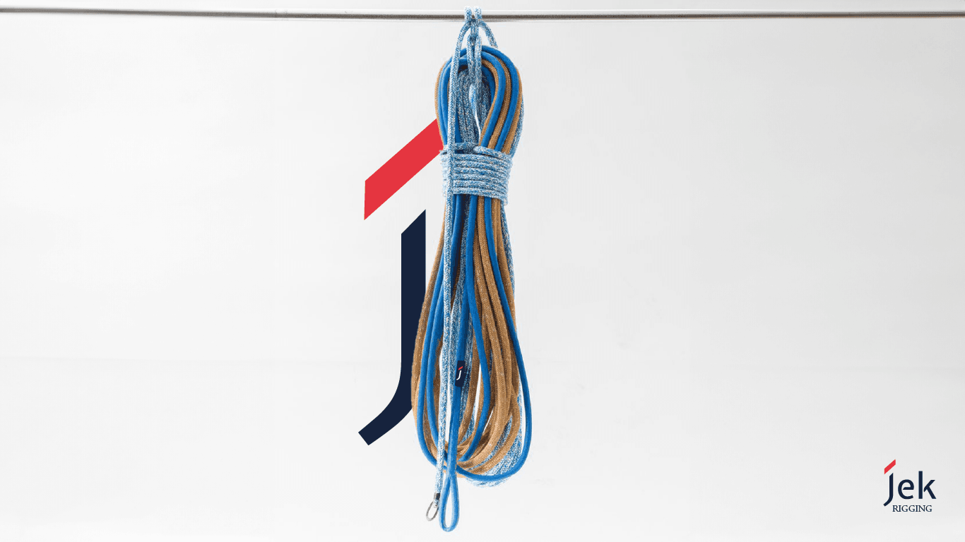
Jek Riggings is a handmade rigging company for which I developed an elegant brand identity. I designed a refined logo that highlights the craftsmanship and quality of Jek Riggings, setting the brand apart with a sophisticated visual presence that appeals to high-end clientele.

Responsibilities

• Developed the brand identity for Jek Riggings, focusing on creating an elegant and timeless visual representation.
• Designed the logo and established visual guidelines to reflect the craftsmanship and quality of the handmade rigging.

Artboard 1 Copy 4

Main Goal

To develop a refined and elegant brand identity for Jek Riggings, a company specializing in handmade rigging.

Target Audience

Sailors, boat owners, and marine enthusiasts seeking high-quality, handmade rigging solutions.

Artboard 1 Copy 2

Process

Research Phase:

Methods: Conducted a competitor analysis and examined various artisanal brands to understand effective visual communication in the rigging and marine industries.
Key Findings: The branding needed to convey quality, craftsmanship, and elegance, setting Jek Riggings apart from more industrial or mass-produced competitors.

Ideation Phase:
Approach:Explored multiple design concepts that emphasized simplicity, elegance, and craftsmanship. Focused on a logo that would appeal to high-end clientele.

Design and Development Phase:
Design Challenges: Striking the right balance between elegance and the rugged nature of rigging.
Solutions: Developed an elegant logo that incorporated maritime elements in a subtle way, using a sophisticated color palette to highlight the brand’s artisanal quality.

Testing and Implementation Phase:
Testing Methods: Presented the logo concepts to stakeholders for feedback and refined the chosen design to ensure it captured the desired brand identity.
Feedback Integration: Made adjustments to the logo to emphasize clarity and ensure its versatility across different branding materials.

Artboard 1 Copy 6 1

Outcome

Quantitative Results: 

Enhanced brand recognition, evidenced by positive feedback from clients and increased interest in the company’s handmade offerings.

Qualitative Feedback: 

Clients appreciated the elegant branding, noting that it effectively communicated the quality and craftsmanship of Jek Riggings’ products.

Personal Reflection: 

This project underscored the importance of creating branding that balances aesthetics with the essence of a handmade product, ensuring both elegance and authenticity.

Conclusion

Project Summary: 

The Jek Riggings branding project successfully established an elegant and distinctive identity, reflecting the high-quality, handmade nature of the company’s rigging. The branding set Jek Riggings apart in the market, appealing to a niche audience seeking artisanal craftsmanship.

Artboard 1 Copy 6