Aeroitalia
Role
Conceptual Designer
Overview
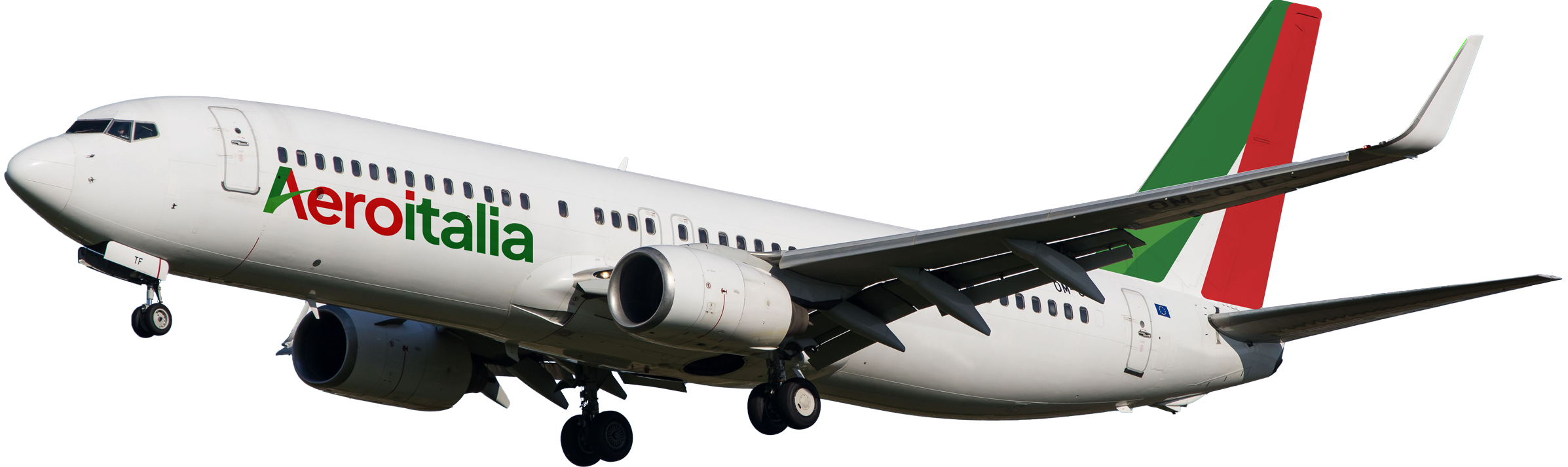
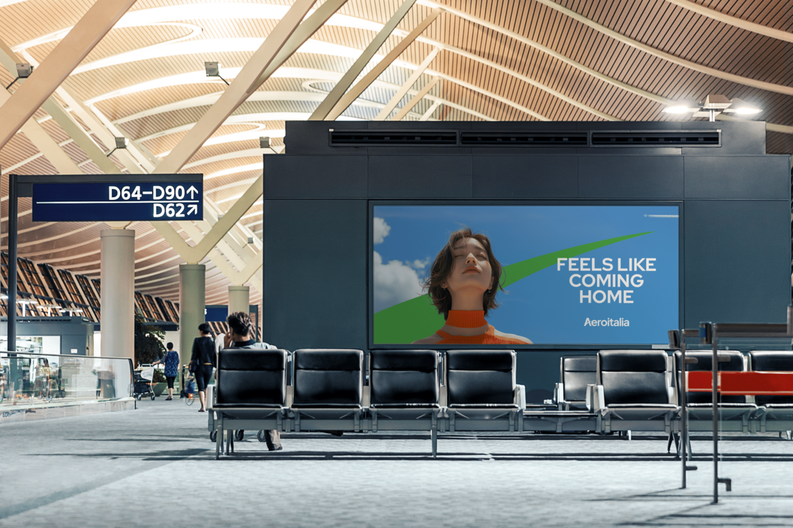
The Aeroitalia Concept Project improved the brand’s visual identity through a refined logo with better kerning and letter-spacing. I extended the branding into a cohesive campaign featuring billboards and designed a sleek aircraft livery, showcasing the updated branding’s potential across diverse applications.
Responsibilities
• Redesigned the Aeroitalia logo to improve its kerning and letter-spacing for a cleaner, more professional appearance.
• Created a campaign concept to showcase the updated logo on billboards.
• Designed an aircraft livery that incorporated the new branding, emphasizing visual cohesion and brand presence.
Main Goal
To enhance the Aeroitalia logo by addressing kerning and letter-spacing issues, create a campaign to showcase its application, and design a new aircraft livery that aligns with the updated branding.
Target Audience
Aeroitalia customers, travelers, and aviation enthusiasts, with a focus on improving brand perception and delivering a cohesive visual identity

Process
Research Phase:
Methods:
Conducted an analysis of the existing logo and its typography. Reviewed examples of effective airline branding and aircraft liveries for inspiration and alignment with industry standards.
Key Findings:
The logo’s kerning and letter-spacing issues detracted from its readability and overall impact, while the branding lacked a strong presence in physical applications like aircraft livery.
Ideation Phase:
Approach:
Focused on creating a refined and visually balanced logo. Explored how the updated branding could translate into impactful applications, such as billboards and aircraft design.
Design and Development Phase:
Design Challenges:
Ensuring the redesign maintained Aeroitalia’s identity while achieving a modern and professional look. Balancing bold visibility with sleek aesthetics for the aircraft livery.
Solutions:
Adjusted the logo’s typography for improved readability and harmony.
Designed a striking yet sophisticated aircraft livery, utilizing the updated logo prominently along with complementary colors and design elements to enhance brand visibility

Outcome
Qualitative Feedback:
The logo redesign, billboard campaign, and aircraft livery were praised for their clean and professional appearance, effectively elevating Aeroitalia’s brand presence.
Personal Reflection:
This project highlighted the importance of cohesive branding across various touchpoints, from typography to large-scale applications like aircraft livery.
Conclusion
Project Summary:
The Aeroitalia concept project transformed the brand’s visual identity through a refined logo, an engaging campaign, and a striking aircraft livery. The work demonstrated my ability to create cohesive branding across diverse mediums, from typography adjustments to large-scale design.